Multi-brand packaging studies created at Crepuscule
Packaging Design · Product Visualisation · Range Systems
Beauty packaging with a clearer shelf story.
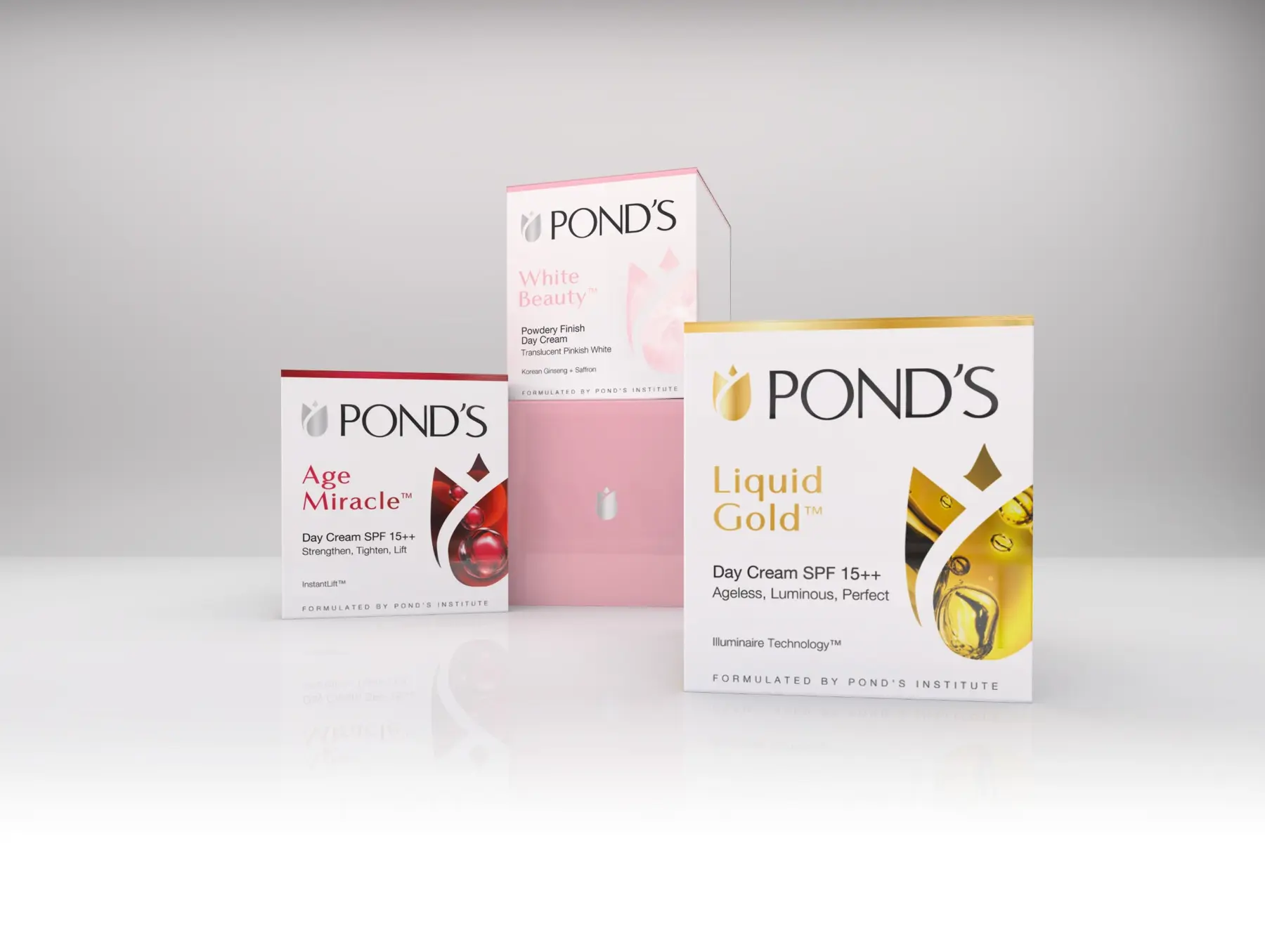
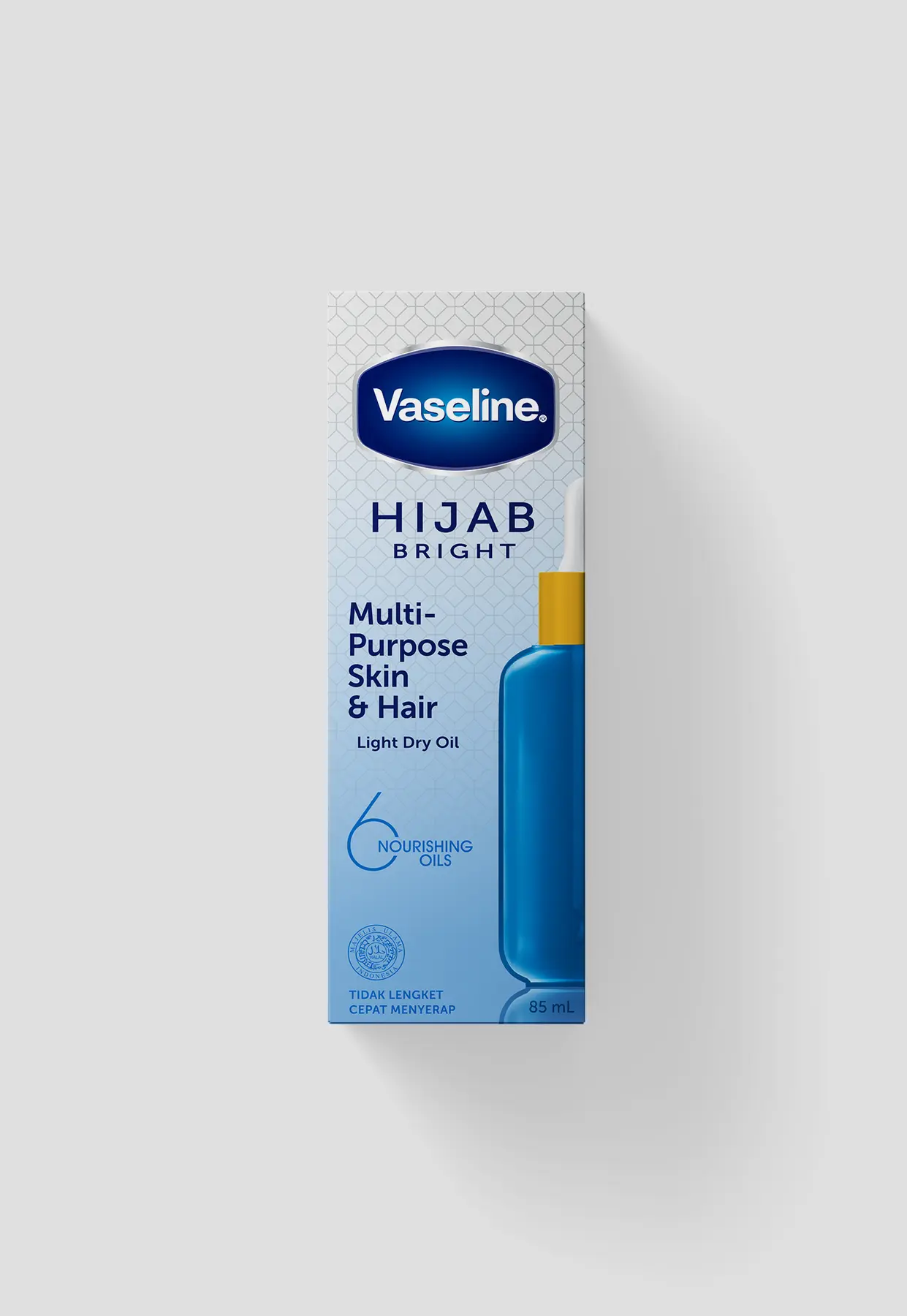
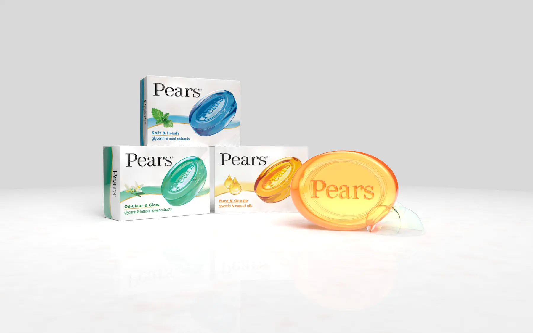
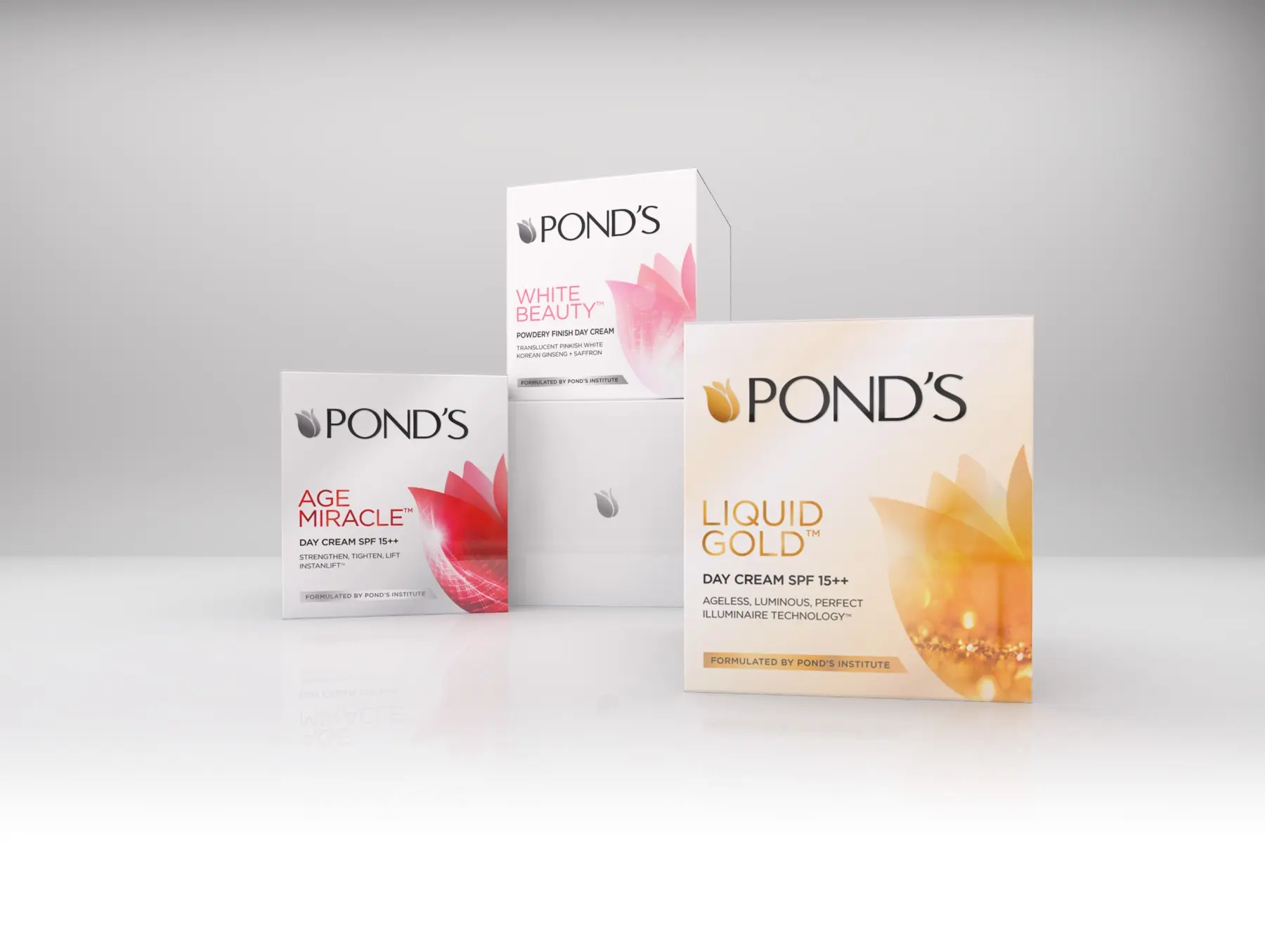
At Crepuscule, I developed packaging studies for Pond's, Vaseline and Pears. Each range needed a clearer story of its own while keeping the familiar cues that made the parent brand recognisable.
- My role
- Packaging concept design and visualisation
- Credit
- Concept studies completed while working at Crepuscule; not presented as launched packaging
Range logic
How the system created difference without losing recognition.
The shelf problem
The products had to separate themselves clearly at shelf without drifting so far that customers stopped recognising the established brands behind them.
The range system
I kept the strongest parent-brand cues in place, then used colour, hierarchy, form and imagery to give each product line a more distinct and understandable role.
What changed across the pack
Packaging directions and product visualisations across the three beauty brands shown.
The design outcome
The study created clearer, more distinct range directions for Pond's, Vaseline and Pears while retaining the visual anchors of each parent brand. The work is shown as concept development, not launched packaging.
3 more views from the project
See the range in use.