Fashion identity created at The Fat Oracle (TFO)
Naming · Brand Identity · Digital Retail
A fashion identity designed to hold its own.
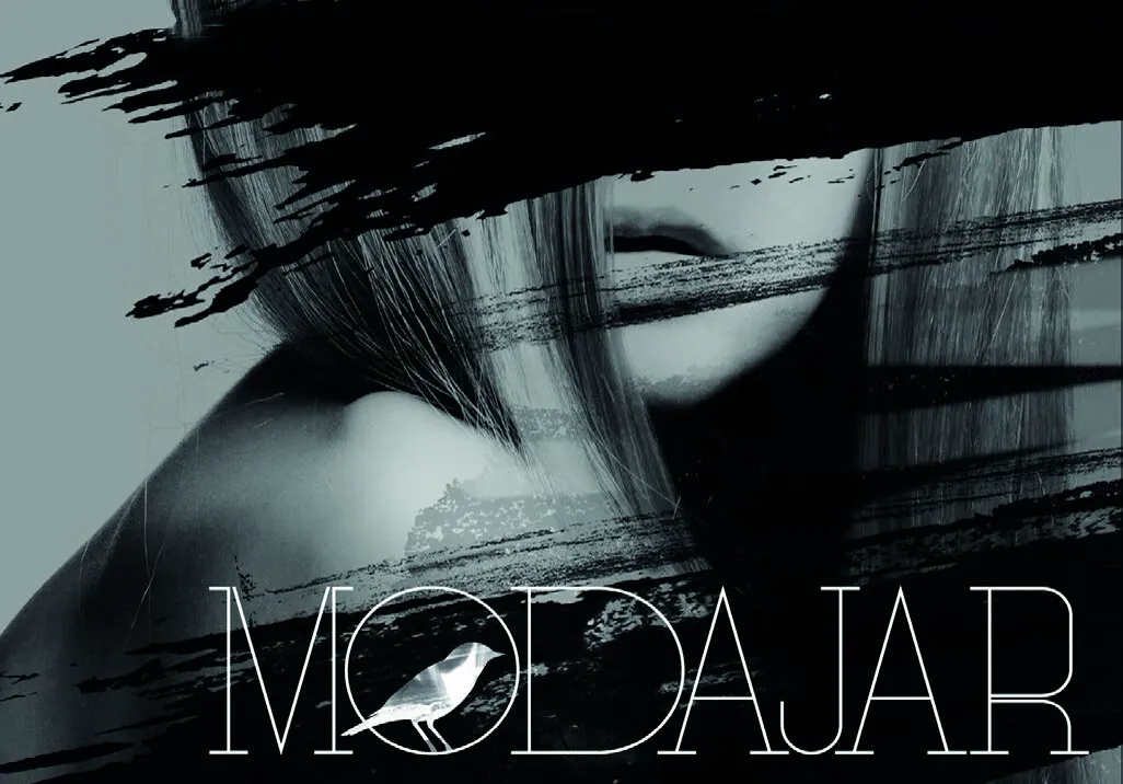
At The Fat Oracle (TFO), I helped build Modajar from the name up. The identity centred on a fine-lined wordmark, a distinctive bird symbol and a restrained visual style that could move comfortably between online retail, campaigns, packaging and stationery.
- My role
- Naming, identity and digital brand design
- Credit
- Completed while working at The Fat Oracle (TFO)
System logic
How the identity idea became a usable system.
The brand problem
Modajar was entering a crowded fashion market without an established name behind it. The brand needed enough confidence to sit beside better-known labels, while remaining clear on a screen and distinctive on small items such as cards, tags and packaging.
The core idea
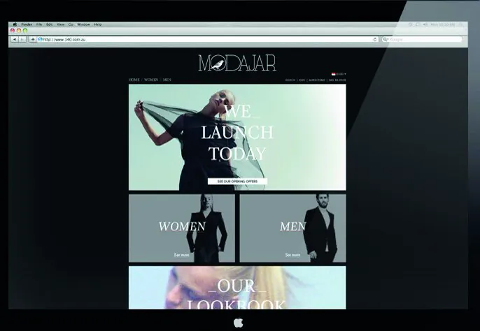
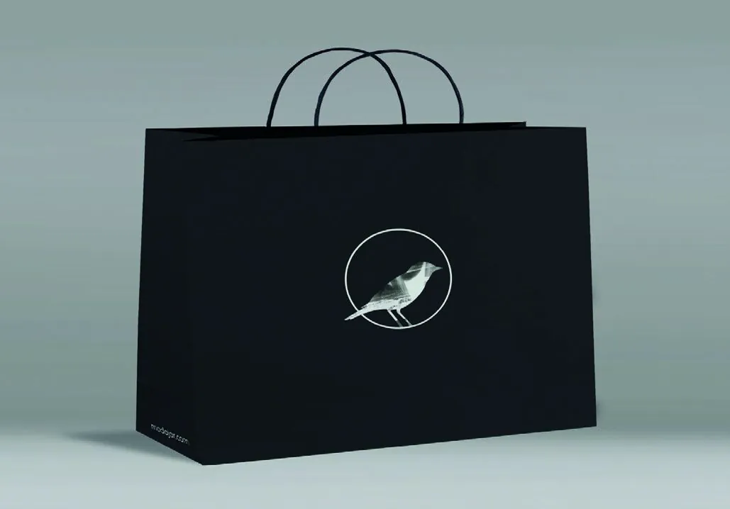
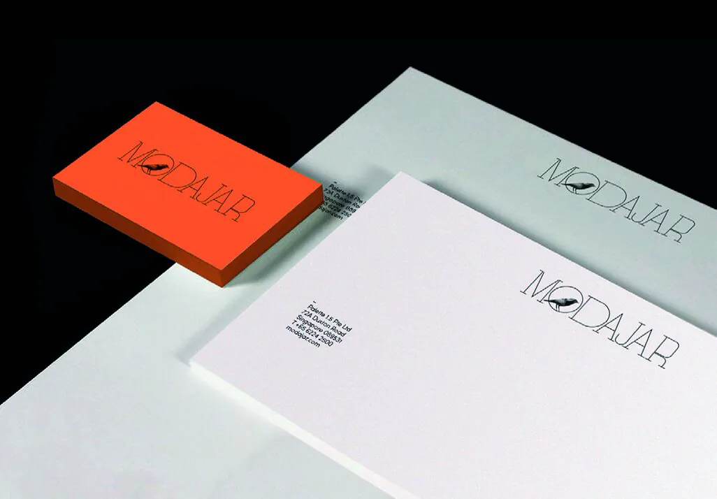
I kept the core identity deliberately simple: the wordmark, bird symbol and a mostly monochrome palette did the heavy lifting. Fashion photography and a sharp orange accent could then change from piece to piece without making the brand feel scattered. I tested the idea on the online store, shopping bag and stationery, not just as a logo on a page.
The system in use
The name, wordmark, bird symbol, launch imagery, online-store direction, shopping-bag graphics, business cards, letterhead and envelopes.
The design outcome
The finished identity gave Modajar one recognisable voice across digital retail and physical brand materials, with enough flexibility for the photography and campaigns to keep changing.
3 more views from the project
See the system in use.