Brand-system work created at The Fat Oracle (TFO)
Brand Identity · Campaign Design · Motion
One clear visual language for a complex innovation brand.
While working at The Fat Oracle (TFO) in 2017, I contributed to SGInnovate's identity and helped extend its modular line language across corporate, event, campaign and motion work. The same simple geometry had to feel credible on formal stationery and energetic at events.
- My role
- Design contribution across identity, campaigns and motion
- Credit
- Completed while working at The Fat Oracle (TFO) · 2017
- Year
- 2017
System logic
How the identity idea became a usable system.
The brand problem
SGInnovate covered deep technology, talent, programmes, partnerships and events. It needed one recognisable identity that could handle all of that without becoming either too corporate or too loose.
The core idea
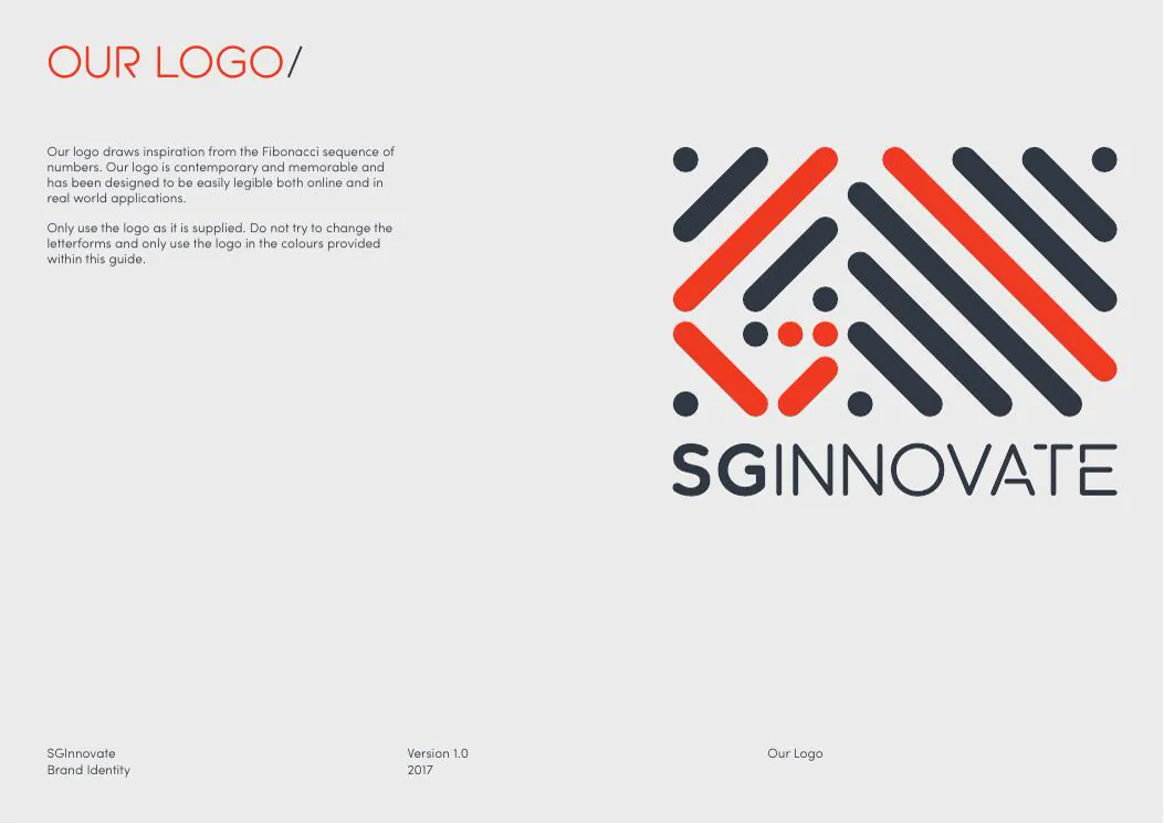
The diagonal lines became a flexible kit rather than a decorative flourish. They could frame information, build patterns, support campaign typography and animate into new forms. Orange, charcoal and white kept everything connected while each programme found its own expression.
The system in use
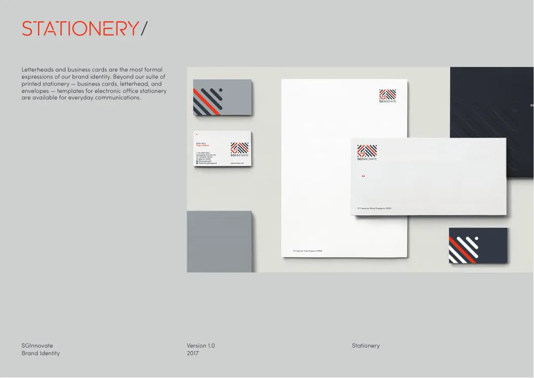
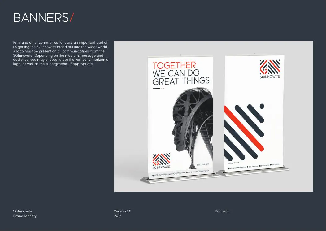
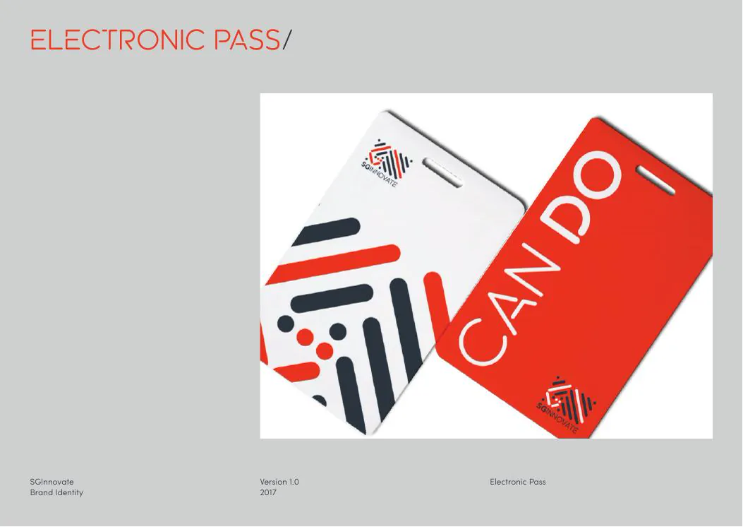
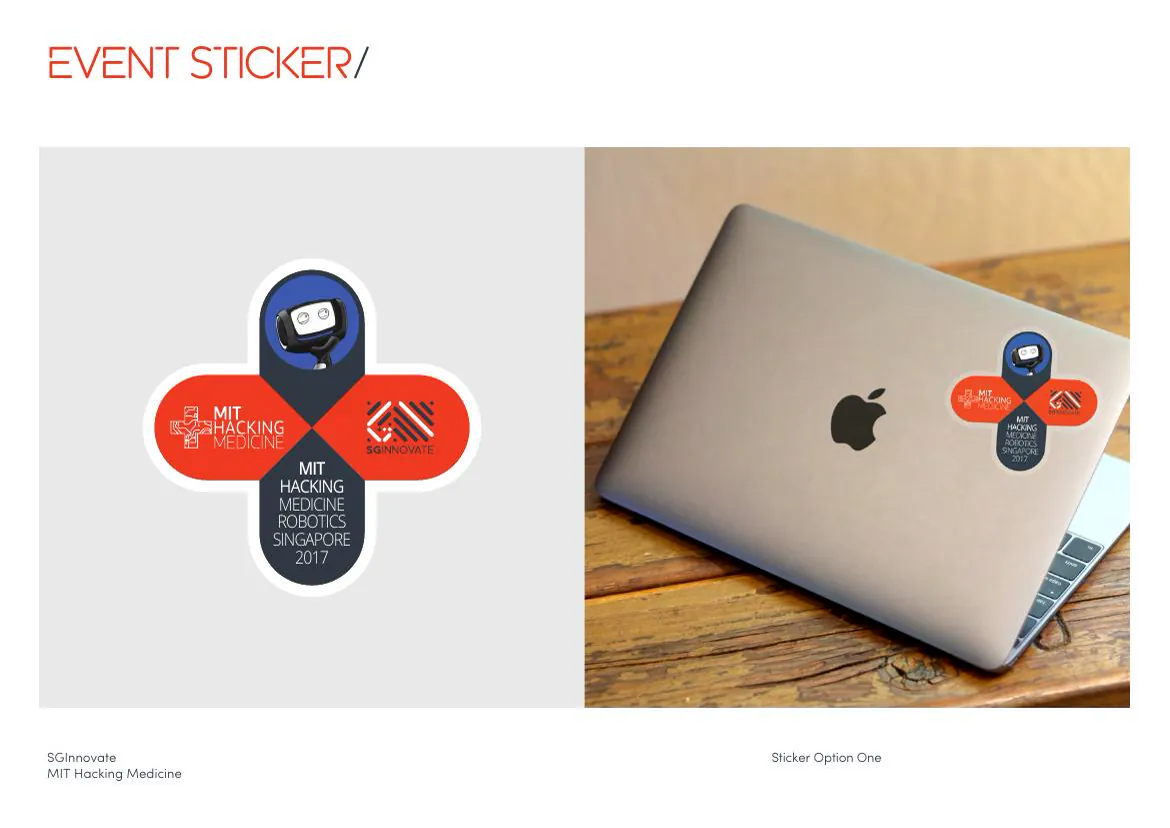
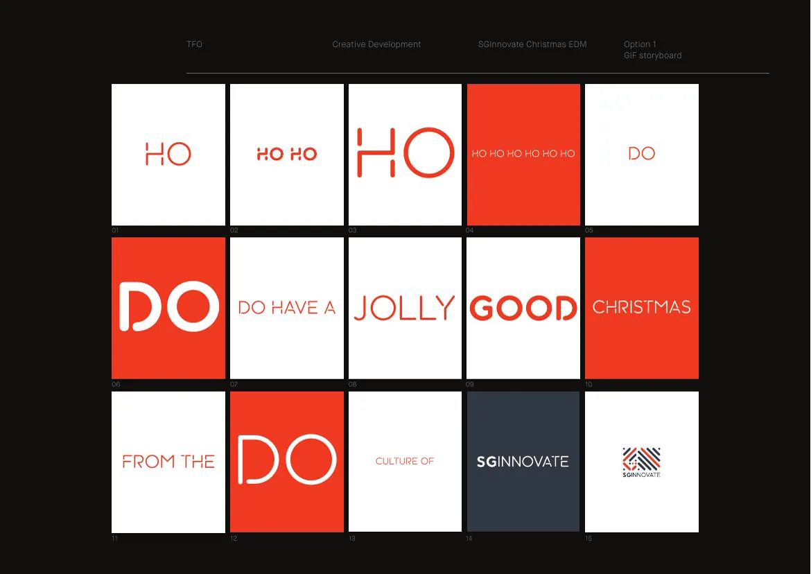
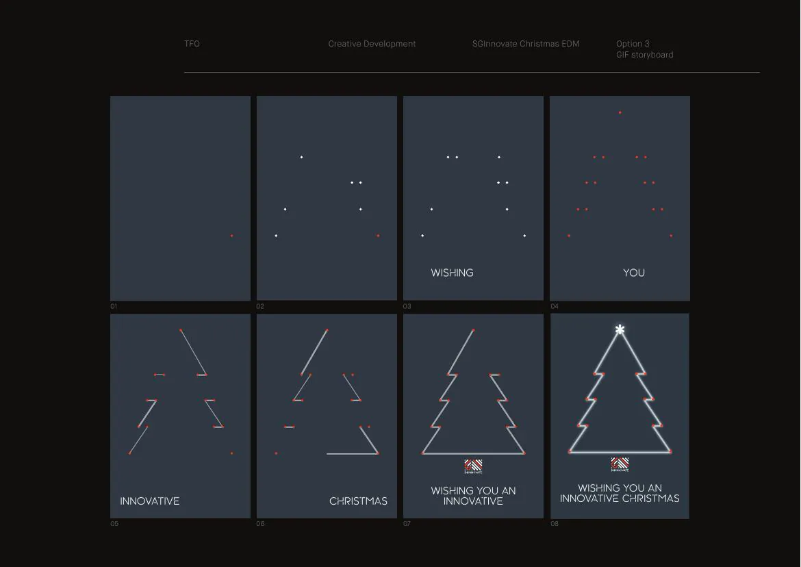
Core identity applications, motion studies, stationery, event banners, an electronic pass, SGInnovate-MIT stickers, a Lunar New Year campaign and Christmas typography and storyboards.
The design outcome
The work showed that one compact visual idea could move from formal stationery to event graphics, collaborations and seasonal motion without losing the SGInnovate identity.
8 more views from the project
See the system in use.