Fast-casual food retail
Naming · Brand Identity · Retail Experience
A food brand built around a bite.
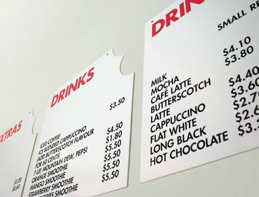
I created the MUNCH name and bite-mark identity, then carried the bright orange system through menus, packaging, counters and takeaway materials. The idea was simple enough to repeat and strong enough to be remembered.
- My role
- Naming, brand identity and retail application
System logic
How the identity idea became a usable system.
The brand problem
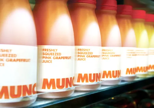
The brand had to stand out in a busy food-retail setting and remain easy to read across everything from a menu board to a juice bottle.
The core idea
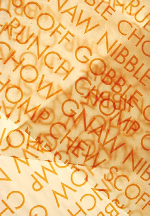
I used the bite mark as the main memory device, paired it with direct typography and repeated the orange confidently across every customer-facing piece.
The system in use
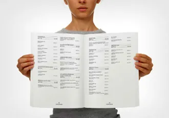
The name, identity, menus, packaging and outlet graphics, all built around the bite-mark idea.
The design outcome
MUNCH gained a lively, repeatable identity that stayed recognisable across the products, menus and physical space.
3 more views from the project
See the system in use.