Consumer-brand refresh work at Crepuscule
FMCG Branding · Label Design · Product Shaping
A global haircare brand, made clearer.
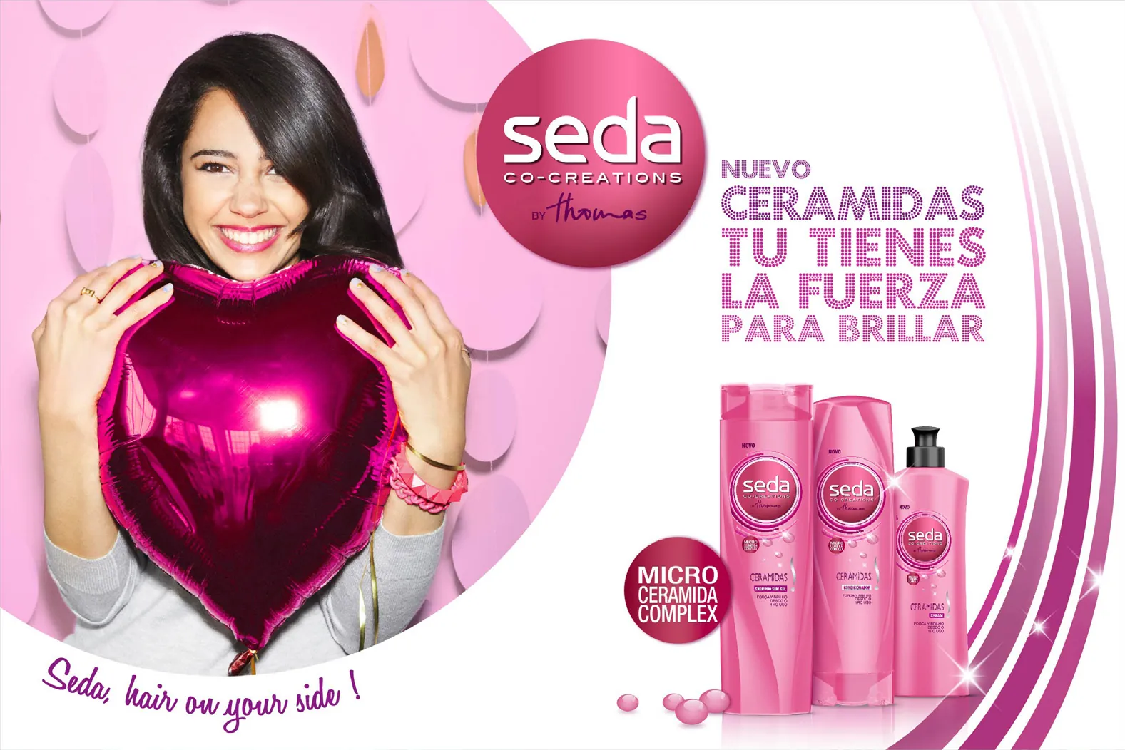
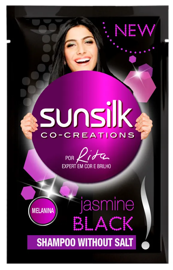
At Crepuscule, I worked on the way Sunsilk showed up to consumers, from label hierarchy and pack form to campaign expression. The aim was to make a familiar global brand feel sharper and easier to navigate without losing what people already knew.
- My role
- Brand, label and product-form design
- Credit
- Completed while working at Crepuscule
Range logic
How the system created difference without losing recognition.
The shelf problem
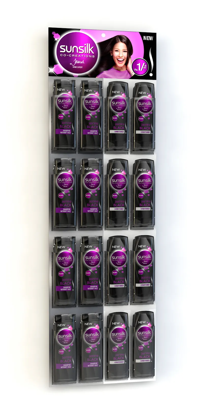
Sunsilk needed greater shelf clarity and a more contemporary feel, but any change had to respect the recognition built by a major global haircare brand.
The range system
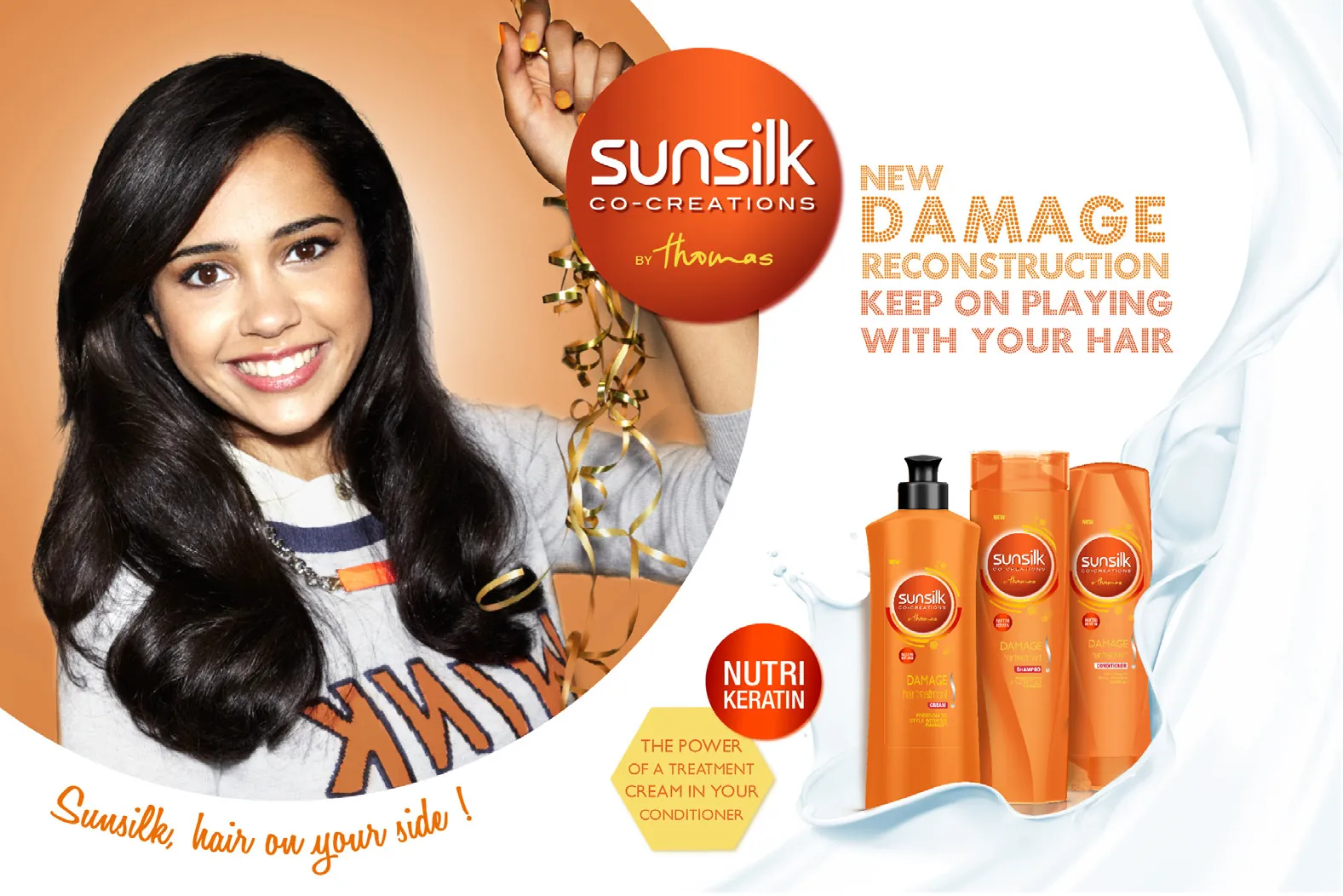
I treated the identity, label information, bottle shape and campaign imagery as one job. Designing them together made it easier to keep the range coherent from the shelf to the advertising.
What changed across the pack
Brand-expression, label, pack-form and campaign directions shown across several Sunsilk ranges.
The design outcome
The work brought the different parts of the consumer experience into one clearer family, while keeping the Sunsilk name and range recognition intact.
3 more views from the project
See the range in use.